HOW TO DECORATE WITH COLOR // So it doesn't look like an explosion at the crayon factory
- Aug 4, 2021
- 6 min read
Updated: Jan 5

Color is a powerful tool. It has the ability to dynamically affect a space, but it can go very, VERY wrong if not done well. As someone whose favorite color is black, I can see how color-loving can quickly take you out of your comfort zone.
The key to decorating with color is knowing what tones work together, so you easily create a space that looks harmonious (instead of like the makeup tent at the clown circus).
So come along as we get down to basics and unlock the not-so-scary mystery of decorating with color!

Before we really dive in to the details, let's talk about the ol' color wheel! Hold onto your lattes - we're going to get nerdy for a hot minute. Honestly, I haven't talked about the color wheel since design school, so this trip down memory lane was a lot of fun for me. But if you and the color wheel are already good buddies, feel free to skip past this part.
We see colors in wavelengths, and the color wheel is a visual representation of colors / hues arranged according to those wavelengths. It allows us to see the relationships between all the colors of the spectrum.

Primary colors - red, blue, and yellow - are colors that cannot be created by mixing any other colors together. They exist entirely on their own, those rebels!
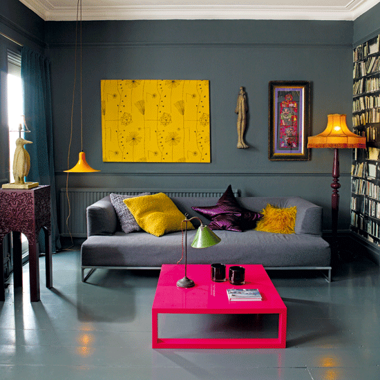
Let’s look at an example of a space decorated in a primary color palette. Here you have red, yellow, and blue taking center stage with yellow as the dominant color. This palette has a youthful, playful vibe, great for kids areas, game rooms, or any room you want to scream "fun!"

Secondary colors - orange, purple, and green - are created by mixing two primary colors together. Secondary color combos create an interesting and inviting atmosphere.
Tertiary colors are created by mixing one primary color and one secondary color together. For example, if you were to mix primary color red with secondary color purple, you would get (wait for it) red purple, which is a tertiary color. It’s kind of straightforward when you think about it.


Complementary colors are where it starts to get interesting. These are colors that are opposite each other on the color wheel. Red and green are complementary colors. Purple and yellow are complementary colors. Blue and orange are also complementary colors! Complementary-colored rooms create vibrant and eclectic spaces. Note: When paired together, complementary colors intensify each other. Keep this in mind when deciding how you want your space to feel.

Now let's touch on one of my favorite combos, analogous colors! These are colors that are next to each other on the color wheel. Shades of blues and greens, for example, create an analogous color palette. Spaces in these palettes tend to feel serene, and pair nicely with a variety of neutrals. Additionally, since analogous palettes are a little bit more difficult to really get wrong, they're a great place to start if you want to explore more color.

The same is true with monochromatics, which is just a fancy word for variations of the same color. Red, maroon, and pink are all monochromatic colors, for example. Tints and shades of one hue create a peaceful environment that's easy to execute.
LOW-RISK WAYS TO EXPERIMENT WITH COLOR


Get in touch with your feelings.
The most important thing to do before redecorating any room is determine how you want your space to feel. Do you want it to feel calm and serene? Playful and fun? Since color can entirely shape the energy of a room, think about the energy / vibe you want to create in there before choosing your color palette.


Experiment with accessories.
All neutral furnishings and paint colors provide the perfect blank canvas to really play with colors that speak to you. And investing in inexpensive accessories is a great way to dip your toe in. But even if you're just using accessories, you still need a plan. Use the 60-30-10 rule to ensure that all those colors feel balanced (you don't want it to look too crazy, now do you?). 60% of the color in your room should be one family, 30% should be another, and just a smattering of a third color will do the trick.


Think small.
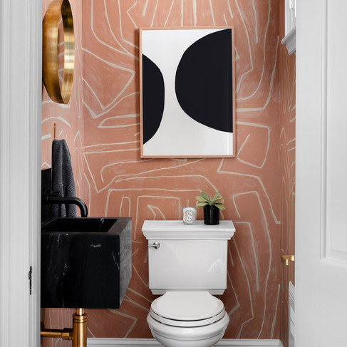
A small, awkward piece of wall or an infrequently used space are great areas for color experimentation! Powder rooms, little office nooks, or even up in the attic feel low risk since they're not your main living area. Plus, because they're not used by everyone everyday, you won't get sick of them as quickly if they have a bolder look. It'll be more like a fun surprise!
If large areas of color make you nervous, tame them with neutrals. Simple hits of black and white work wonders to neutralize colorful areas.


Start with the art! (or pillow or rug...)
OK, so you're ready to decorate with color, but are still unsure of what actual colors to choose? Start with an inspiration piece and go from there. A patterned pillow, a large colorful rug, or a big piece of art are all great places to start when you want to inject more color but don't know how. And don't forget that 60 - 30 - 10 rule! Pull out 3 colors, with a focus on one as your star.


Put it on repeat.
Once you choose a color palette, it's important to repeat it in all your rooms for consistency. Now before you pump the brakes and hit me with a "Woah, Nelllie!", hear me out. This doesn't mean you have to use the EXACT same formula in every room, but unless you're going for that whole "funhouse" thing, pull the same color vibe throughout your home.
Let's look at an example. Both images above use the same color palette, but the dominant color is different between the two. In the bedroom, the blush takes center stage with the teal as an accent, whereas the teal is the star in the living room. Both spaces feel connected, but not repetitive. You could even take that one step further and have a room with all neutrals, and just one tiny teal moment. As long as you're pulling from the same box of crayons, so to speak, your color story will feel cohesive.


Not matching is matching.
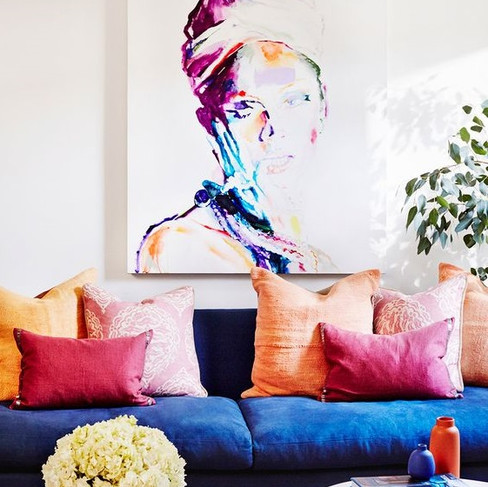
When working with color, it's important to not match the colors exactly. Instead, vary the shades and hues to create interest and depth. If you want orange to be your accent color, make sure you pull in some hues that are really muted, some that are really dark, and some that are vibrant. Work that color spectrum! A burnt orange paired with a pumpkin orange will feel curated instead of one-note.


The all light space & the dark space
Black and white are colors, too, so don't be afraid to go all in. Monochromatic (variations of a single color) spaces look chic and refined. They do take some thought to pull it off, though, as they can sometimes feel stark and cold. Adding in a variety of tones and textures will ensure your monochromatic space has drama and depth.
It is a misconception that only large spaces can be painted in dark colors! If you have a super large room or a tiny office with minimal natural light, dark colors will actually serve to make the room feel cozy and inviting. One of my most favorite paint tricks is painting a small space in a super dark color. The accessories pop beautifully and the whole room feels like a chic British lounge. Definitely worth a try!

Color can be a great way to completely change the energy of a space, try something new, and express your personality.
Hopefully the tips above gave you the confidence to try some color in your own space! If you're already on the color train and things still aren't working, troubleshoot by asking yourself:
• Is the color direction clear and defined?
• Does this space invoke the feeling I want?
• Are there enough neutrals to tame the color?
With a little planning, you'll easily take your home from color mediocre to color masterpiece! And remember - it's (mostly) just paint! You can always, always change it.
Hi-fives all around,
Stacey
PS - Still drowning in paint chips or just need more tips? We're here to help with a personalized home color consultation!


Comments